Print Advertisement 1: Masters of Sex Promotion
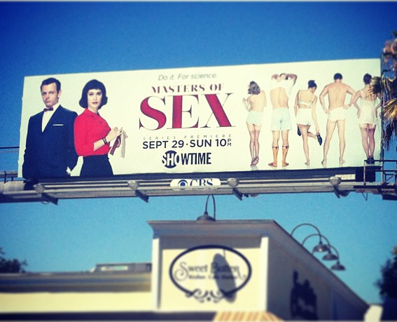
Format: The billboard advertisement is printed in color, although it only used minimal colors (in this example, white, black and red) to emphasize the title of the show and the main actors on the left. It has a bit of a "retro" or old-school look to address the setting of the new drama.
Kind of image: This is a realistic image, with actual people posing on the right side of the billboard, who seems to be dressing down for an experiment. The man and woman at the left of the billboard seems to be a couple or partners because of how they are closed to each other.
Audience: This billboard is an advertisement to the new Showtime series, Masters of Sex. Based on the subtitle above the title ("Do it. For Science."), it is intended for mature audience who has a certain level of curiosity with sex on a scientific basis. The billboard may seem racy because of the title, but it can be noticed that the models does not pose on risqué angles or does not expose much of their bodies. The advertisement rely on the word "sex" being overly bold and bigger than the other words in the billboard to attract attention.
Emotions: The billboard stimulates a certain level of curiosity among its audience. As what is said before, it does not show any racy pictures but a natural response towards the word sex is polarized: either people get aroused to it, or people avoid the topic publicly because it is taboo.
Composition and Layout. The layout of the billboard wants the audience to target the word "sex" in the center, without having the distraction of having other models pose in sensual positions. Having both Michael Sheen and Lizzy Caplan pose on the left adds credibility to the series and express it as a show worth watching. Giving more "tease" to the audience, the only information left is the premiere date of the show, the date, and the network where they could watch the series.
Text: Combining the subtitle "Do It. For Science.", and the title Masters of Sex, the advertisers of this program made an excellent play of words showing the basic plot of the story in just a few words. Using the word Masters, it gives a preview to the audience that the story is about William Masters and Virginia Johnson, two pioneering researchers in the field of human sexuality.
Response: The audience would tune in to the show because of the "tease" that the billboard gave. It is also expected that the audience who would respond to this billboard advertisement is to have an open mind about the nature of the show.
Print Advertisement 2: Campbell's
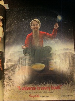
Format: The advertisement is printed in color. The background used a black color, but it is filled with "stars" to give the setting of the outer space or the universe.
Kind of image: It is a whimsical image, although a real kid is used as a model. The way that the kid has grown a moustache at a young age to show wisdom and holding a spoon that acts as a wand cannot happen in real life, although the image gives the impression that he possesses wisdom.
Audience: The audience may seem to target both kids and parents, but it is directed more to the parents. Naturally parents would want to make the right decisions for their children especially when it comes to food. With the message of the advertisement saying that Campbell's soup contains the universe in every bowl, it eliminates the guesswork of choosing the best noodle soup.
Emotions: The print advertisement shows a lot of fun in the image, implying that choosing Campbell's soup would make their children happy and satisfied in eating their product.
Composition and Layout: Choosing the outer space as a setting, this ad promotes a specific kind of their soup, "The Chicken and Stars Soup". Making the child model hold a spoon with a photoshopped effect that seems that he is scooping stars makes it appear that he can have a spoonful of stars in his bowl.
Text: The advertisement did not use much words in promoting the product. The catchphrase "A Universe in Every Bowl." highlights the photo.
Response: Parents with little kids would buy this product because it seems that the kid in the photo is promoting this brand of soup based on his experience.
Print Advertisement 3: Extra Chewing Gum
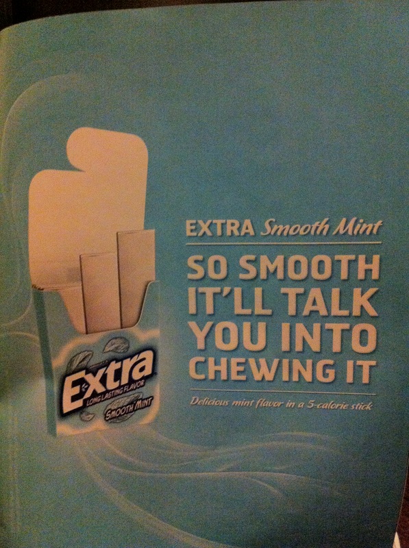
Format: The advertisement is printed in color, with only two colors dominant (blue and white).
Kind of image: It is a minimalist advertisement with an actual picture of a pack of gum.
Audience: This advertisement attracts to almost all kind of consumers who purchase packs of gum. It also caters to people who are conscious about calorie consumption because of the 5-calorie reference at the bottom of the main text.
Emotions: This advertisement exudes a "cool" image with colors and puns used. The swirl or wave of white line around connotes a breath of fresh air upon consuming this product.
Text: Using the phrase "So Smooth It'll Convince You Into Chewing It" expresses that the product is effective among it's competitors. It exudes a sense of power through humor that none of their competitors cannot achieve. For example, a pack of gum cannot really talk, but as the advertisement suggests that their product alone can do that just by trying their pack of gum.
The subtext below caters to people who are conscious of their calorie consumption by specifying how much calories there are in a single stick of gum.
Response: The ad would attract consumers because of it's sense of humor and how it relates to the young audience because of how it appeared to be relevant because of the language used.
Print Advertisement 4: Dunkin' Donuts
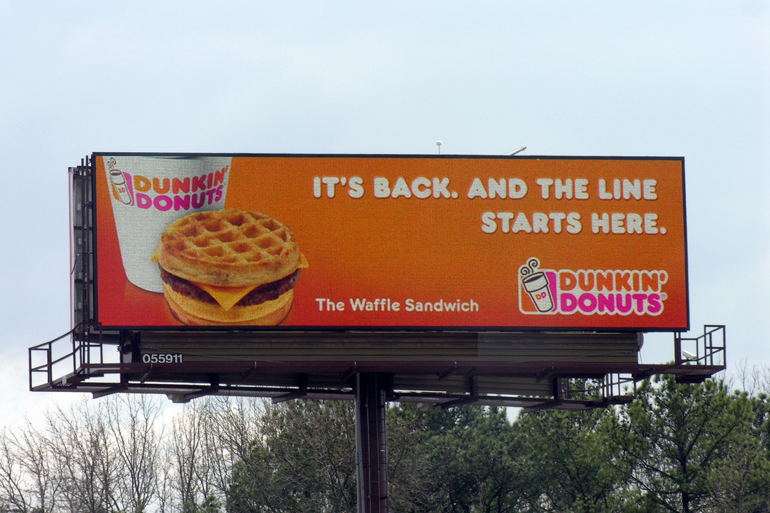
photo courtesy of: blogs.cuny.edu
Format: It has a picture of a cup of coffee and a "Waffle Sandwich" on the left, dominantly orange color on the background, and a logo of Dunkin' Donuts on the lower right of the billboard.
Kind of Image: It is an advertisement with minimalist composition, with a real picture of the product on the lower left of the billboard and a text that occupies a quarter of the space.
Audience: This advertisement targets consumers on the go, specifically on their way to school or work. This would appeal most of the buyers who is still deciding on buying their breakfast along the way.
Emotion: This advertisement plays with the emotions of the consumer, particularly both senses of taste and smell. Having the cup of coffee and the sandwich be printed on a larger scale entices the potential buyer to actually drive in a Dunkin' Donuts store and purchase the product. It also triggers a sense of nostalgia to the consumer, as the aroma from the coffee can bring memories of a breakfast dining table at home.
Text: The text implies that this product has been one of the favorites in their store, and it grew as one of their best sellers.
Response: The combination of the slogan and the blown-up image would attract more buyers to go to Dunkin' Donuts. The originality of using a waffle as the bun rather than a typical burger bun gives Dunkin' Donuts more edge than a local coffeehouse or fast food chain.
Print Advertisement 5: M&Ms Chocolate (Holiday Edition)
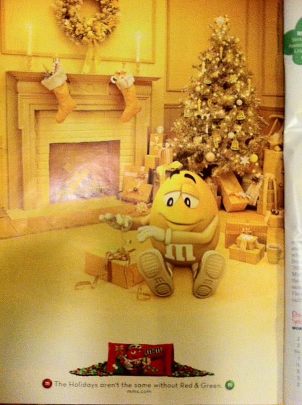
Format: It is a holiday-themed picture in monochromatic color scheme, with a Christmas tree and a fireplace in the background.
Kind of Image: Though the holiday theme is real and present in most households, having an M&M chocolate as the main model makes the advertisement fictional.
Audience: The target audience for this advertisement are avid consumers of the M&M's chocolate. There is not much of a difference in taste among the flavors, but having only the colors green and red exclusive in a bag makes it a special treat for the consumers.
Emotion: Chocolates or sweets in general is said to release "endorphins," or the happy drug. This picture expresses the joys of the holidays with the unwrapping of the gifts and combining it with an animated piece of candy. Though the setting is meant to be happy, printing the main picture in a monochromatic color scheme makes the audience sense that something is missing, making the eye search the whole advertisement and finally locating the red bag of M&M at the bottom.
Text: There is only one line of subtext at the bottom, saying that the "Holidays aren't the same without Red and Green." This emphasizes the special release of the brand with a product fitting for the Christmas season, since the colors red and green are associated with Christmas.
Response: For a typical consumer familiar with the product, there is not much response in purchasing this special bag of M&M candies. But for people who are entertaining or baking, this may look like a product that they would buy.
Print Advertisement 6: Elizabeth Taylor Perfume
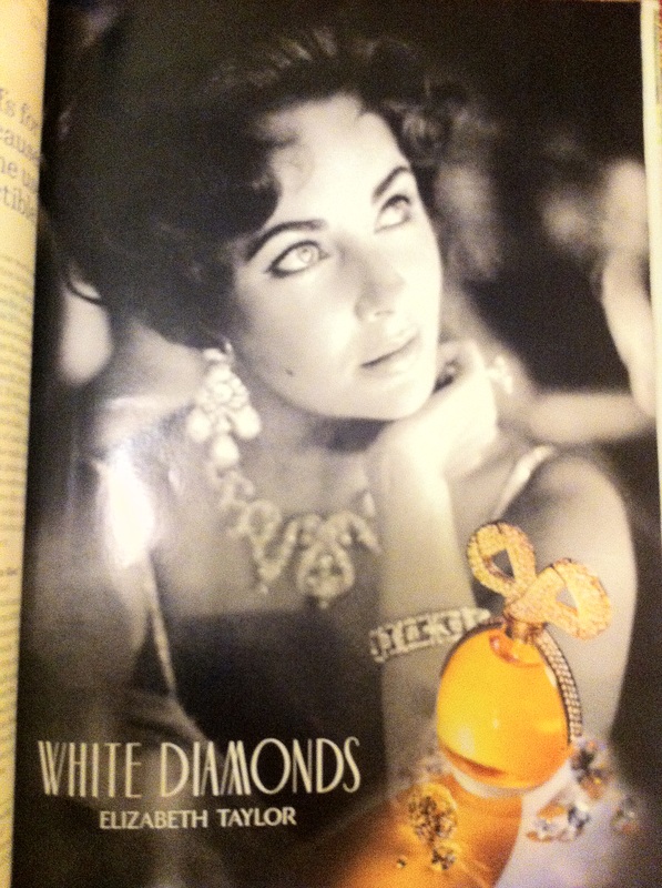
Format: It is a black and white photo of an elegant woman, with the actual product printed in color on the bottom right of the advertisement.
Kind of Image: It is a real still image of Elizabeth Taylor, looking glamorous and elegant as she was always portrayed in photos. The bottle of perfume on the bottom of the ad is an image of the actual product that almost looks like "liquid gold".
Audience: The advertisement appeals to the female middle-aged consumer who can afford to purchase high-end products for their own consumption.
Emotion: The photo of Elizabeth Taylor wearing a necklace and a pair of earrings exudes elegance from the advertisement, and Elizabeth Taylor herself depicts beauty and grace even in a mature age.
Text: There is minimal text in the advertisement, mentioning the name and brand of the product.
Response: Upon looking at the advertisement, I was drawn into the image of Elizabeth Taylor and was captivated by her beauty. Even though we are years apart, it made me imagine a version of myself being glamorous and graceful. My only concern is that the product may seem out of touch with the audience of my age, so I would not respond to buying it at a department store.
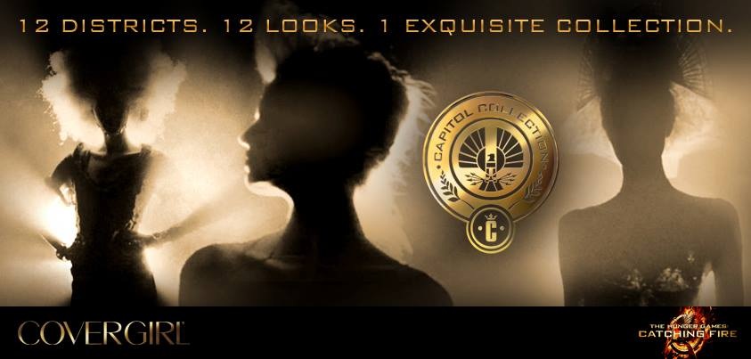
Print Advertisement 7: Covergirl Cosmetics, The Hunger Games Edition
credits to: mockingjay.net
Format: The advertisement uses black and gold as a color scheme, with three women forming their silhouettes against the light. At the bottom right of the advertisement is the logo of the second installment of the popular Young Adult series, The Hunger Games: Catching Fire.
Kind of Image: Though the women forms silhouettes that portrays images of real women, their make-up, costumes and hairstyle is unknown to the consumer. Unless if one is familiar of the trilogy, a consumer may relate a silhouette to a certain character in the story. The hairstyles of the women is a bit over-the-top compared to a typical female.
Audience: The advertisement targets the female consumer in the late teens and young adults, particularly those who belong in The Hunger Games fan base.
Emotion: Having the women form a silhouette and not showing their face gives the advertisement a sense of mystery, especially since the advertisement id for a brand of cosmetics. The trilogy has casts that have over-the-top make-up and although Covergirl is known for having a wide range of hues when it comes to make-up, it is curious to see what has the company come up with to gain more buyers.
Text: The slogan above states how many possible looks one can create out of the new collection. It is printed in gold to be cohesive with the remainder of the ad.
Response: More consumers will be drawn in purchasing the product. The protagonist in the story - Katniss Everdeen - is a likeable character and a lot of young female wants epitomize her. Relating their fashion and make-up to the story gives them a sense of empowerment as a fan of the trilogy.
